
Creating Basic Visualizations with NYC's OpenData
Background
New York City’s OpenData Portal is a wealth of interesting datasets published by City agencies. They’re great for everything from practicing your data science and visualization skills, to extending and enriching datasets you’re already working on.
In this post, we’ll look at:
- How to connect to and query NYC OpenData’s API
- How to visualize the data returned and begin to shape exploratory data analysis
We won’t quite get to in-depth analysis or statistical modeling. Rather, this post is meant to help you generate and explore questions around a dataset before planning for a deeper dive.
What You’ll Need
Before starting, you should sign up for a developer account and generate an API or app token. To minimize the risk of publishing your API token on GitHub accidentally, I’d recommend storing it separately and loading it as an environment variable. Hadley Wickham’s overview of the best practices for managing secrets provides steps on how to do this.
NYC OpenData lives on Socrata, which provides solid API documentation and examples in a number of scripting languages. We’ll use two specific libraries to facilitate connecting to the Socrata API: One that makes the request(RSocrata), and another that lets us quickly write queries (soql.
We’ll be using the DOB Job Application Filing data for exploratory analysis. As of writing, this dataset has 96 variables/columns; we’ll only be beinging in 13, and actively working with 4 to 5.
We’ll also use athe ggthemes packages to style our ggplot2 visualizations. If you want to choose your own themes instead of using prebuilt ones, you can use Coolors to build palettes.
Let’s get the basics set up:
library(RSocrata)
library(soql)
library(tidyverse)
library(leaflet)
library(lubridate)
library(ggthemes)

dataset_id <- 'ic3t-wcy2'

api_endpoint <- paste0('https://data.cityofnewyork.us/resource/', dataset_id, '.json')

api_token <- Sys.getenv('SOCRATA_TOKEN')
Building Queries
One thing to be mindful of when working with OpenData is that some data types may not be stored as you would expect. For example, dates are often stored as text strings, which can make queries a little trickier. Here are two vignettes you can use to filter by date depending on how it’s stored:
Date Stored as Date
Example: Return all records from the last 100 days
#soql_where(paste0("DATE_API_NAME_GOES_HERE> '", Sys.Date() -100, "T12:00:00'"))Date Stored as String
Example: Return all records from 2020
#soql_where(paste0("DATE_API_NAME_GOES_HERE like '", "%252020'"))More complicated example: Return all records from February 2020
#soql_where(paste0("DATE_API_NAME_GOES_HERE like '", "%2502/%25/2020'"))You’ll notice that you have to URL encode the % by using %25 before the year and month values.
Now let’s build a query using the soql parameters. This particular dataset stores several of its dates as text strings, so we’ll need to use the second option to pull records from 2020. Try to be mindful of the number of records you’re asking for. The DOB dataset has more than 1.7 million rows, and the maximum number the API can return is 50,000. We’ll limit it to 20,000 for today, but if we needed to pull more and didn’t want to be too hard on the API, we could use pagination.
query_params <- soql() %>%
  soql_add_endpoint(api_endpoint) %>%
  soql_limit(20000) %>%
  soql_select(paste("job__",
                    "job_type",
                    "job_status",
                    "latest_action_date",
                    "building_type",
                    "city_owned",
                    "pre__filing_date",
                    "approved",
                    "owner_type",
                    "non_profit",
                    "job_description",
                    "gis_latitude",
                    "gis_longitude",
                    sep = ",")) %>%
  soql_where(paste0("pre__filing_date like '", "%252020'"))
Finally, let’s make the API call:
query <- read.socrata(query_params)

nrow(query)
## [1] 15859Our query returned 15723 rows! Let’s take a look at a few of the first rows and columns.
head(query, n = 5)[1:4]## job__ job_type job_status latest_action_date
## 1 322021110 A2 J 2020-01-09
## 2 421778963 NB J 2020-02-04
## 3 123843145 A2 B 2020-02-24
## 4 123795009 DM E 2020-04-01
## 5 322030930 A2 P 2020-02-25Exploring the Data: What About COVID-19’s Impact?
One of the obvious first questions we can ask is whether the number of construction job applications filed in 2020 has been impacted by COVID-19. Since New York State and City have limited construction to only essential buildings during the PAUSE, we might expect to see this reflected in the data. Let’s build a graph so we can see whether our hunch is correct.
First, let’s get the right data into the right format. We’ll need to:
- Change those pre-filing dates from text strings to actual dates
- Group by a period of time (we’ll go by week, as day is too granular and month might not let us see smaller fluctuations)
- Count the unique number of filings per that period of time
- Graph it!
Steps 1, 2, and 3
query$pre__filing_date <- as.Date(query$pre__filing_date,
                                  format = '%m/%d/%Y')

num_prefiled <- query %>%
  subset(select = c("job__",
                    "pre__filing_date")) %>%
  group_by(week_num = isoweek(pre__filing_date)) %>%
  summarise(num_unique_filings = n_distinct(job__))
Step 4
bar_chart <- ggplot(data = num_prefiled,
                    aes(x = week_num,
                        y = num_unique_filings)) +
  geom_bar(stat = "identity",
           fill = '#9E67AB',
           alpha = 0.7) +
  geom_text(aes(label = num_unique_filings),
            vjust = 1.5,
            color = 'white',
            size = 3,
            fontface = "bold") +
  geom_vline(xintercept = 12.5,
             color = '#70757A',
             size = 2) +
  labs(title = "Number of DOB Job Prefilings Per Week in 2020",
       caption = "Source: NYC OpenData") +
  xlab("2020 Week Number") +
  ylab("Number of Unique Applications Pre-Filed") +
  theme_few() +
  theme(plot.title = element_text(hjust = 0.5, face = "bold"),
        axis.title.x = element_text(face = "bold"),
        axis.title.y = element_text(face = "bold"))

bar_chart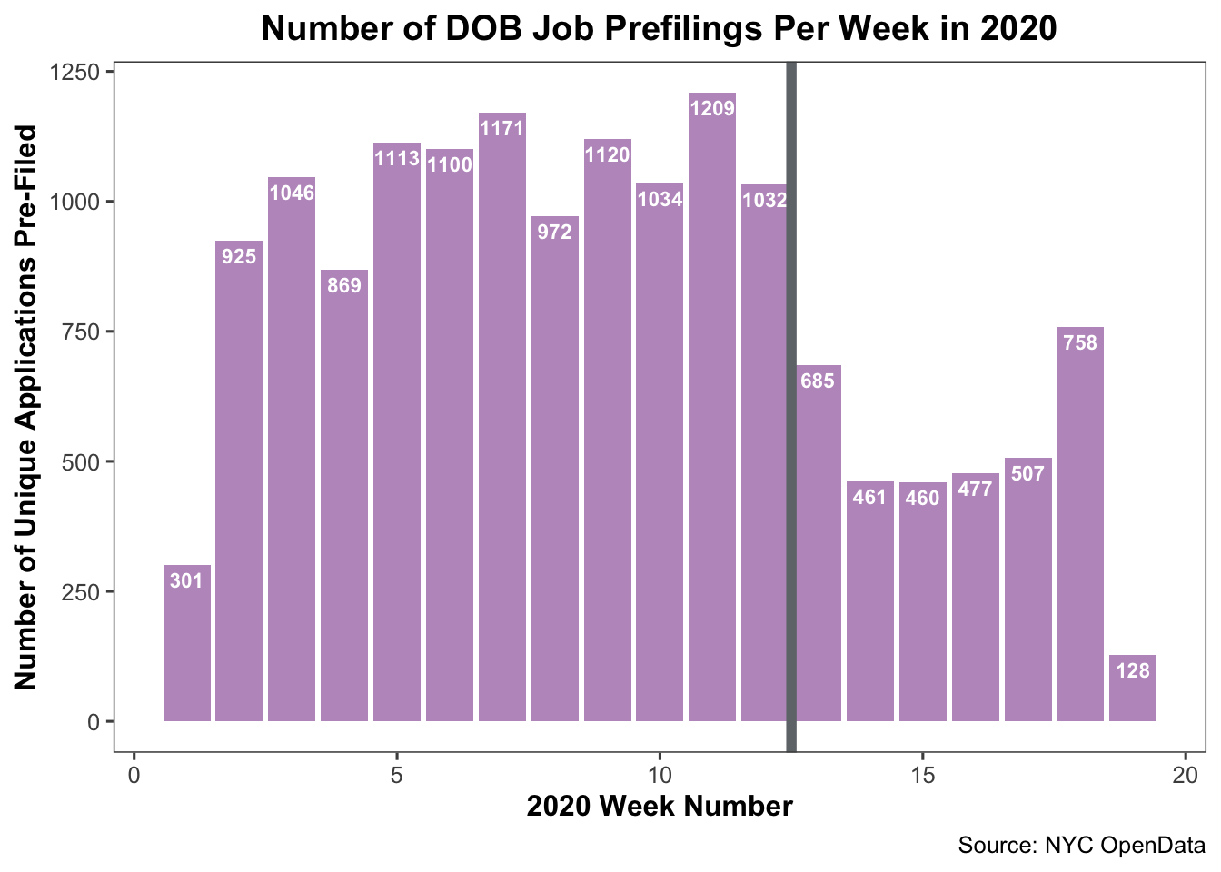
The PAUSE went into effect on March 22; right at the end of week 12 and beginning of week 13 of 2020. We can add a reference line to represent this at x-intercept 12.5 (between the two weeks).
From what we can tell, there was a dip in DOB job prefilings after the PAUSE went into effect. There are a number of reasons why this could be:
- Speculation around the real estate market in NYC given the long-term impact of COVID-19
- Organizations encountering operational/financial difficulties because of the economy
- Staffing at DOB running low due to illness/remote work issues resulting in fewer records process
- A million other contributing factors we haven’t yet identified
To responsibily and reliably assess the possible correlation and its strength, we’d need additional data and a much longer blog post. We’ll skip that for now, and stick to the EDA.
Exploring the Data: Who’s Still Filing Applications?
Although the applications dipped after the PAUSE went into effect, there’s continued data to suggest at least some organizations still filed. Who are these folks? Are they associated with essential, City-owned building construction?
Let’s create another chart type to look at the different categories of organizations/individuals submitting DOB job applications, and how their actions have changed in 2020.
We’ll need to: 1. Group our data by the organization type filing the applications 2. Count the number of prefilings per organization type category each week 3. Graph it again!
Steps 1 and 2
filings_by_org_type <- query %>%
  subset(select = c('job__','pre__filing_date',
                    'owner_type')) %>%
  group_by(owner_type,
           week_num = isoweek(pre__filing_date)) %>%
  summarise(num_unique_filings = n_distinct(job__))
Step 3
area_chart <- ggplot(data = filings_by_org_type,
                     aes(x = week_num,
                         y = num_unique_filings,
                         fill = owner_type)) +
  geom_area(color = "white",
            size = 0.3,
            alpha = 0.7) +
  scale_fill_few() +
  theme_few() +
  theme(plot.title = element_text(hjust = 0.5,
                                  face = "bold"),
        axis.title.x = element_text(face = "bold"),
        axis.title.y = element_text(face = "bold")) +
  geom_vline(xintercept = 12.5,
             color = '#70757A',
             size = 1) +
  labs(title = "Number of DOB Job Filings in 2020 by Organization",
       caption = 'Source: NYC OpenData') +
  labs(fill = "Org Type") +
  xlab("2020 Week Number") +
  ylab("Number of Unique Applications Pre-Filed")

area_chart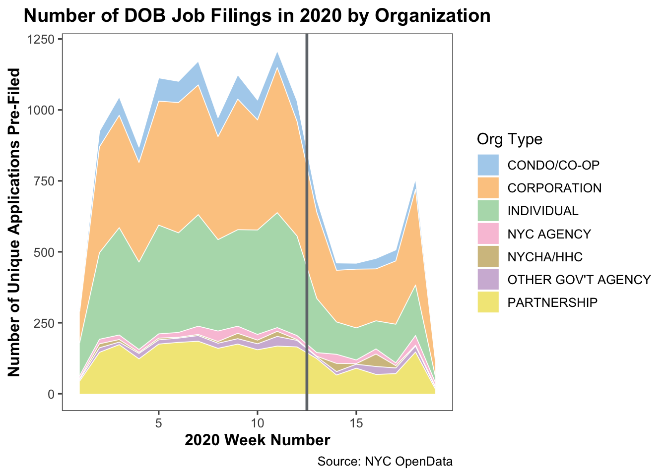
Again, we see the dropoff around March 22. Eyeballing the stacked area chart, it looks like most organization types started reducing the number of filings in the weeks leading up to the PAUSE, with the largest reduction taking place after it was in effect. However, government organization types do appear to have a slight increase after the PAUSE was implemented. Note: NYCHA and HHC represent New York City’s Public Housing Authoroty and Health and Hospitals entities, respectively.
We can explore this further by breaking the stacked area charts into separate line plots using ggplot’s facet_wrap function.
We’ll need to:
- Filter for just the government organization types
- Group by organization type
- Count the number of job filings per week by organization type
- You guessed it; plot it one more time
Steps 1, 2, and 3
gov_org_type <- query %>%
  subset(select = c('job__','pre__filing_date',
                    'owner_type')) %>%
  filter(owner_type == "NYC AGENCY" |
           owner_type == "NYCHA/HHC" |
           owner_type == "OTHER GOV'T AGENCY") %>%
  group_by(owner_type, week_num = isoweek(pre__filing_date)) %>%
  summarise(num_unique_filings = n_distinct(job__))
Step 4
line_plot <- ggplot(data = gov_org_type,
                    aes(x = week_num,
                        y = num_unique_filings,
                        group = 1)) +
  geom_line(color = '#9E67AB',
            size = 1.5,
            alpha = 0.7) +
  facet_wrap(~owner_type,
             ncol = 1) +
  theme_few() +
  theme(plot.title = element_text(hjust = 0.5,
                                  face = "bold"),
        axis.title.x = element_text(face = "bold"),
        axis.title.y = element_text(face = "bold")) +
  geom_vline(xintercept = 12.5,
             color = '#70757A',
             size = 1) +
  labs(title = "Number of DOB Job Filings in 2020 by Organization",
       caption = 'Source: NYC OpenData') +
  labs(fill = "Org Type") +
  xlab("2020 Week Number") +
  ylab("Number of Unique Applications Pre-Filed")

line_plot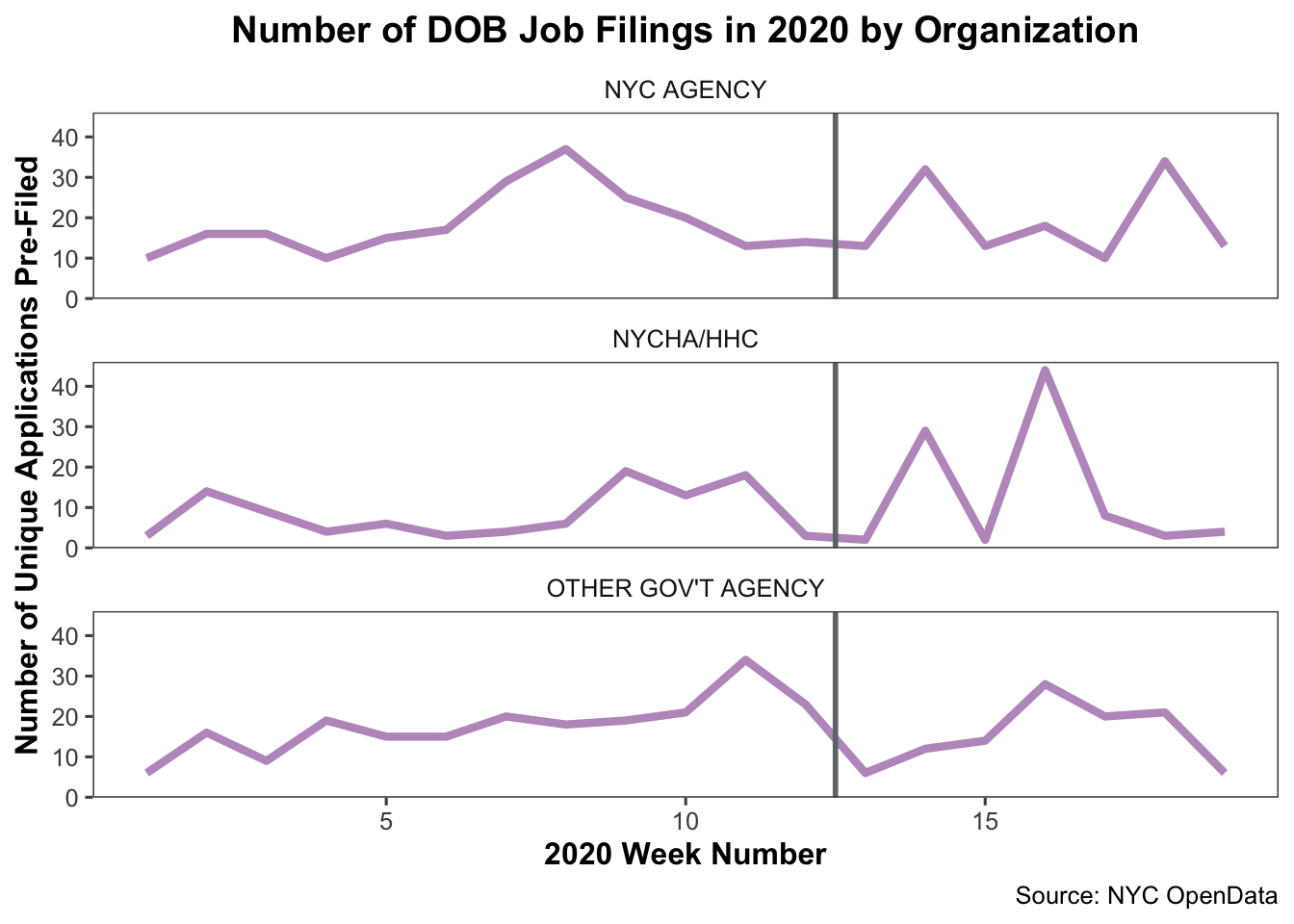
These plots seem to suggest that ‘Other Gov’t Agency’ type organizations did roughly double the number of DOB job applications submitted at certain points after the PAUSE. The other two types of government agencies didn’t seem to increase their average filings, and followed a similar trajectory as the other non-government organizations.
So, is this significant? Maybe. If it were relevant to the overall analysis you hoped to do or any other hypotheses you had, it might be worth picking the data apart more to understand what happened with ‘Other Gov’t Agency’ organization types.
For now, we’ll move on.
Exploring the Data: Where is this All Happening?
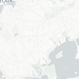
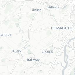
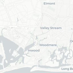
The DOB Jobs data includes several geospatial components that could provide an interesting analysis. Since we’re taking a very quick, very high-level exploratory look at the data, let’s put together a basic map to see where the potential construction sites for these filings are.
To build a map, we will:
- Subset the data to include the latitude and longitude for each job
- Correct the data types as needed
- Set up the palette to use for the map
- Generate the map using the Leaflet for R package
Steps 1, 2, and 3
job_locs <- query %>%
  subset(select = c('gis_latitude',
                    'gis_longitude',
                    'approved',
                    'building_type',
                    'owner_type')) %>%
  drop_na()

options(digits = 8)

job_locs$gis_latitude <- as.numeric(job_locs$gis_latitude)
job_locs$gis_longitude <- as.numeric(job_locs$gis_longitude)

few_colors <- c('#F15A60', '#7AC36A', '#5A9BD4',
                '#FAA75B', '#9E67AB', '#CE7058',
                '#D77FB4')

factpal <-colorFactor(palette = few_colors,
                      domain = job_locs$owner_type)
Step 4
dob_job_locations <- leaflet(job_locs,
                             width = "100%",
                             options = leafletOptions(minZoom = 10,
                                                     maxZoom = 18)) %>%
  setView(lng = -74.0200 ,
          lat = 40.7128, zoom = 11) %>%
  addProviderTiles(providers$CartoDB.Positron) %>%
  addCircleMarkers(
    lng = ~gis_longitude,
    lat = ~gis_latitude,
    popup = ~owner_type,
    label = ~owner_type,
    color = ~factpal(owner_type),
    radius = 2,
    stroke = FALSE,
    fillOpacity = 0.7) %>%
    addLegend(
      "topleft",
      pal = factpal,
      values = ~job_locs$owner_type,
      title = "Organization Type",
      opacity = 0.7,
      )

dob_job_locations
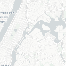


CORPORATION
INDIVIDUAL
NYC AGENCY
NYCHA/HHC
OTHER GOV'T AGENCY
PARTNERSHIP
At first glance, we see that a lot of Condo/Co-Ops and Corporations are filing applications for sites in Manhattan. In the other boroughs, we see more individual owners filing.
Next Steps
Keep exploring! You can generate similar visualizations using some of the other variables we imported from the dataset, refine your research questions, identify additional data sources to blend in, and begin to perform statistical analyses.